






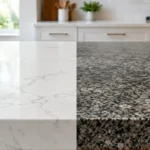
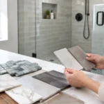
A grout sample can look like a minor detail on a showroom board, then become the first thing you notice every morning in a new shower or kitchen. Grout covers a surprising amount of visual space, especially with small tile, mosaics, or a detailed backsplash. Knowing how to choose grout color before installation helps the tile look intentional, makes cleaning expectations more realistic, and avoids a finish that feels busier or darker than planned.
Start With the Look You Want the Tile to Create
Grout can either fade into the tile or become part of the pattern. Neither approach is automatically better. The right choice depends on whether you want the tile itself, the grout lines, or the overall surface to lead the design.
A close-match grout creates a quieter, more continuous finish. With a soft white subway tile, a warm white or very light gray grout can make a kitchen backsplash feel clean without calling attention to every individual rectangle. In a bathroom with large-format porcelain tile, matching grout often helps the floor or shower walls read as one larger surface. This approach is especially useful when you want a calm, spa-like room or when the tile has natural movement that deserves the attention.
A contrasting grout makes the layout more visible. White tile with charcoal grout, for example, gives a wall a crisp grid and adds definition to a classic or modern design. It can be a strong choice for a herringbone backsplash, hexagon floor tile, or a pattern you want to highlight. The trade-off is that every variation in spacing, every corner, and every line will be more noticeable. A precise installation matters even more when the grout is a major design feature.
Midtone grout is often the practical middle ground. Gray, taupe, beige, and soft greige shades can define the tile without producing a high-contrast pattern. They also tend to hide everyday dust, cooking residue, and minor discoloration better than bright white grout. For many active Michigan households, this balance delivers a polished look that is easier to live with.
How to Choose Grout Color Based on the Room
The room’s lighting, traffic, and use should influence your decision as much as the tile sample does. A grout color that looks perfect under showroom lighting can appear completely different next to your cabinets, vanity, paint, and natural light.
Kitchens Need Beauty and Everyday Practicality
Backsplashes are usually viewed at eye level, often under bright under-cabinet lighting. That makes grout lines highly visible. If you are installing white, cream, or handmade-look tile, avoid choosing a grout that is dramatically whiter than the tile unless you want a deliberately outlined look. A grout that is too bright can make warm tile appear dingy by comparison.
For a backsplash behind a range, light grout can work beautifully, but it will need regular cleaning. Grease splatter and cooking stains are part of real kitchen use. A soft gray, mushroom, or warm taupe grout may offer more forgiveness while still keeping the room light. With patterned tile, look for a grout color that supports the background tone rather than competing with the pattern.
Floor tile deserves a separate decision from the backsplash. A kitchen floor sees shoes, pets, dropped food, and tracked-in moisture. Very pale grout lines on a heavily textured or light-colored floor may require more maintenance than homeowners expect. A medium shade that relates to one of the tile’s deeper tones is often a more durable visual choice.
Bathrooms Have Different Moisture and Cleaning Concerns
In a shower, grout is part of a wet environment that needs correct preparation, installation, and ongoing care. White grout can make a shower feel bright and fresh, but it can also show soap residue, hard-water minerals, makeup, and color transfer from shampoos or bath products. A light gray or warm neutral is frequently easier to maintain without making the shower feel dark.
For bathroom floors, consider how the grout will look after a busy morning. Very dark grout with white tile creates a bold, graphic appearance, but lint, toothpaste dust, and mineral residue can show on dark surfaces. Light grout can show dirt near the entry and around the toilet. A balanced midtone often works well, particularly for family bathrooms.
Do not assume every bathroom should have the same grout color. The shower wall tile, shower floor mosaic, main floor, and accent niche may each need a slightly different approach. A small mosaic shower floor usually benefits from a color that blends with the tile and does not turn hundreds of grout joints into the focal point.
Test Samples Where the Tile Will Be Installed
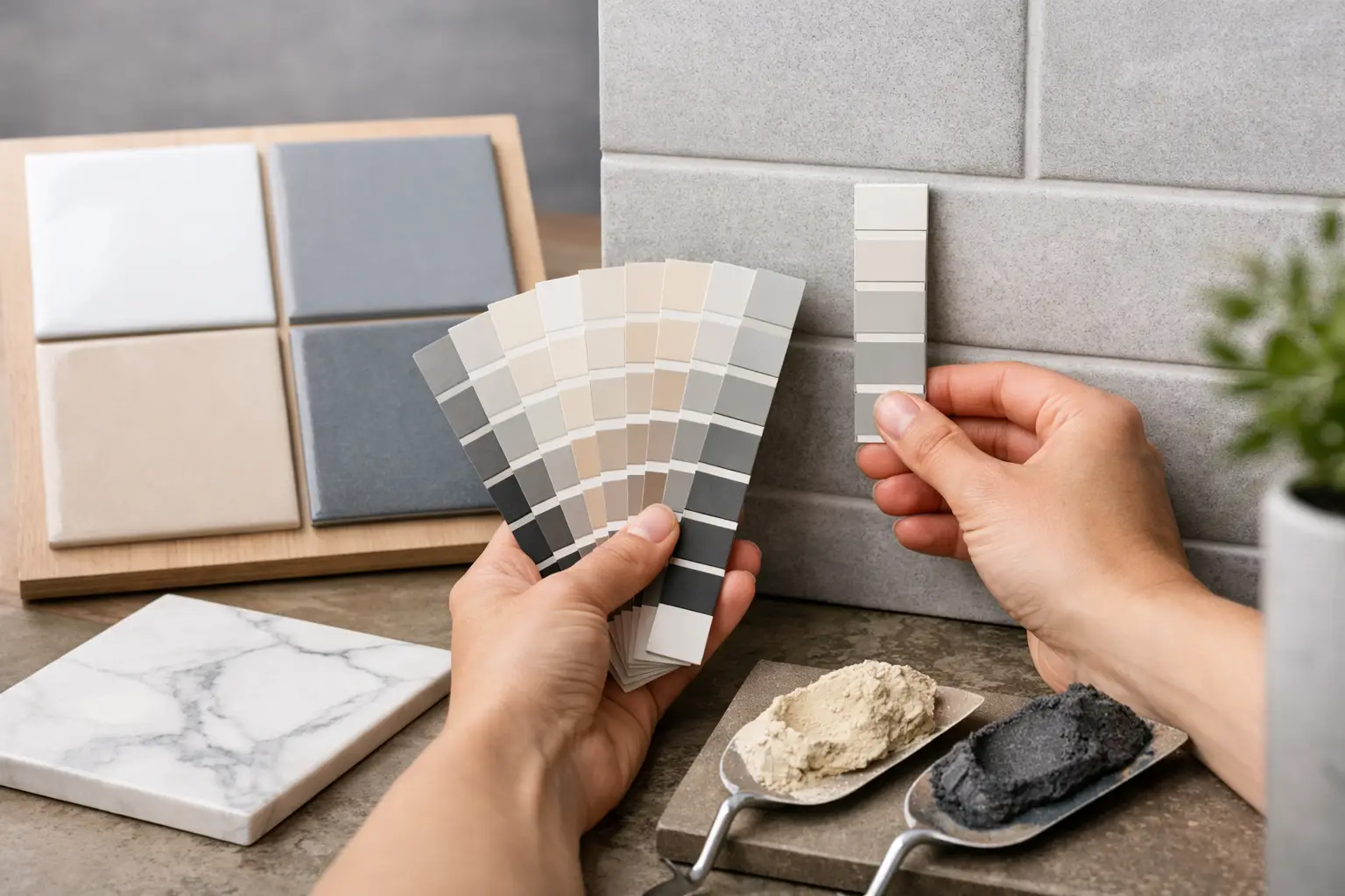
Grout colors become lighter or darker as they cure, and the surrounding finishes affect how the final color reads. Rather than selecting from a tiny paper chart alone, place several grout samples directly against the actual tile. Look at them in daylight, at night, and with the room’s installed or planned lighting.
This step is particularly important with white tile. “White” can lean cool, warm, creamy, or gray. A cool blue-white grout next to warm ivory tile can make the tile look yellow. The same issue happens with grays: some lean blue, others lean brown or green. Compare samples to the cabinet finish, countertop, paint, and fixtures as well as the tile.
If possible, create a small mockup with a few actual tiles and the intended joint width. This is more reliable than holding a grout swatch beside a single tile. The wider the grout joint, the more the grout color affects the finished room. A one-sixteenth-inch joint on large porcelain tile will read very differently from a three-sixteenth-inch joint around subway tile.
Consider Tile Size, Texture, and Pattern
Small tile creates more grout lines, so grout choice has a larger visual impact. Penny rounds, hexagons, mosaics, and basketweave patterns can look busy with a strong contrast. Blending grout usually lets the pattern show without overwhelming the room. On the other hand, a subtle contrast can give a plain subway tile layout more character.
Large-format tile has fewer joints, which gives you more flexibility. Matching grout can make a compact bathroom floor appear broader and less segmented. A contrast can still look sharp, but it will emphasize the tile layout and any unevenness in the room’s walls or floors.
Textured tile also deserves a closer look. Handmade-look ceramic, stone-look porcelain, and tile with uneven edges have natural variation. A grout that contrasts heavily may exaggerate those variations. That can be desirable in a rustic or vintage-inspired design, but it may not suit a clean, tailored bathroom renovation.
Choose for Maintenance Without Giving Up the Design
No grout color is maintenance-free. Light colors show dark dirt and stains. Dark colors can show mineral deposits, soap haze, lint, and dried cleaning products. The best practical choice is usually a shade close to the tile’s middle value rather than its lightest or darkest point.
Grout type and installation quality matter, too. The appropriate product depends on the joint size, tile material, and location. Some projects call for cement-based grout, while others may benefit from high-performance or epoxy options. These materials have different color ranges, cleaning requirements, and installation characteristics. A professional installer can help ensure the selected grout is compatible with the tile and the space, not just attractive on a display board.
Sealers can help protect certain grout products, but they are not a substitute for routine cleaning or proper shower construction. Use cleaners recommended for the tile and grout, avoid harsh products that can damage finishes, and address discolored caulk or cracked grout before moisture becomes a larger repair issue.
Make the Final Choice With the Whole Room in Mind
The best grout color is not always the one that stands out first. It is the one that supports the room you want to live in, works with the lighting, and fits your willingness to clean and maintain it. A dramatic contrast can make a simple tile installation memorable. A close match can make a small bathroom feel calmer and more expansive. Both can be excellent decisions when they are made deliberately.
Before tile installation begins, take a few minutes to review the actual tile, grout samples, joint size, and surrounding finishes together. At Renovation Innovations, that detail-focused planning is part of turning a kitchen backsplash or bathroom tile design into a finished space that looks right from every angle. The goal is simple: choose a grout color you will still feel good about after the dust has settled and daily life begins.
